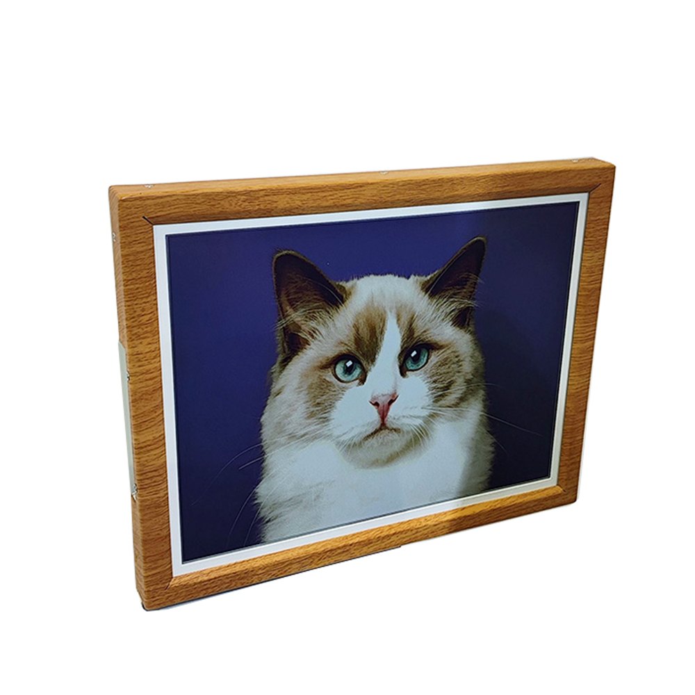
Short answer
Colour E-Ink builds every image out of just six pigments, so three things are true and none of them are defects: close up you can see a fine dot pattern, the white is paper-white rather than backlit-white, and the whole picture gets better or worse with the light in your room. It looks like a good print, because optically it behaves like one. If you are expecting a phone screen on a wall, you will be disappointed — and that mismatch, not the technology, is what drives most negative first impressions in this category.
Key facts
- Spectra 6 panels use six pigments: black, white, red, yellow, green and blue. Everything else is dithered from those.
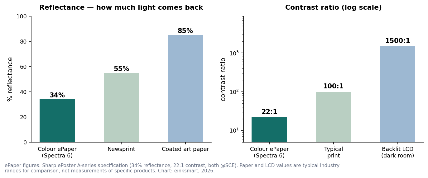
- Reflectance is about 34% — nearer newsprint than coated art paper, and nothing like a backlit screen.
- Contrast ratio is about 22:1, against roughly 100:1 for a typical print and far higher for an LCD in a dark room.
- In buyer comments we analysed, image quality was the sixth most-raised theme — and most of those comments were about expectations, not faults.
- Grain visibility depends on viewing distance versus pixel density, not on panel size by itself.
Six pigments, and why that is the whole story
An LCD makes colour by mixing light; ePaper makes colour by moving solid pigment particles. A Spectra 6 panel holds six coloured pigments in each microcapsule layer and drives the right ones to the surface. There is no seventh colour available anywhere on the panel — so a sunset, a skin tone and a navy jacket are all assembled from patterns of those six, exactly the way a printing press builds a photograph out of four inks.
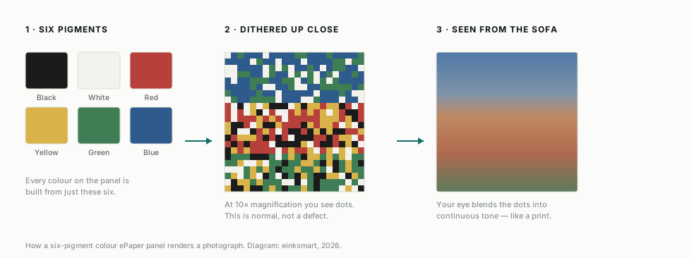
One buyer in a public campaign comment section explained this to another buyer better than most vendors do: the full colour, he wrote, “comes from dithering of 6 base colors. There are always be dots.” He was right, and the fact that a customer had to say it is a failure of the industry’s marketing, not of the panel.
So will I see the dots?
At arm’s length on a small frame, if you look for them, yes. At normal wall distance, no. This is the same halftone logic as print: hold a magazine photograph six inches from your eye and the rosette pattern is obvious; put it on a wall and it is a photograph. The threshold is viewing distance against pixel density, which we worked through in our size guide — at 131 ppi the dots merge beyond about 0.67 m.
Why the white looks grey
Because it is paper-white, and paper-white is darker than you remember. A colour ePaper panel reflects roughly 34% of the light that falls on it. Coated art paper returns far more; a backlit screen generates its own light and is not comparable at all. Your eye has no absolute reference for white — it judges by what is next to it.
The matboard trap
If you frame a colour ePaper panel behind a bright white mount, you have put a reference white directly beside a 34% white — and the panel will look grey by comparison. One buyer described exactly this, noting that the white mat “only emphasizes how gray the default background of the picture is”. The fix is not a better panel; it is a warmer, softer mount, or none at all. This is ordinary framing craft: picture framers have always chosen mount colour against the artwork, and an ePaper panel is simply another artwork with its own white point.
Why photographs can come out warm or “sepia”
Two separate causes, and only one of them is fixable by the vendor.
- Gamut compression. With six primaries, saturated cyans, magentas and deep blues have no exact match. A rendering engine must approximate them with neighbouring pigments, and the safest approximations tend to run warm. A blue sky becomes slightly dusty; a teal becomes closer to grey-green.
- Poor dithering and colour mapping. This is software, and it varies enormously between brands using identical panels. A good pipeline preserves skin tones and lets the sky stay a sky; a lazy one posterises gradients and pushes everything toward sepia. One buyer asked publicly whether he was “the only one” seeing a sepia cast across all his photos — he was not, and the panel was not the problem.
This is the single largest quality difference between products built on the same glass, and it is why we treat the rendering pipeline as a core product rather than a utility — the approach is described on our technology page. If you are comparing two frames with the same panel and one looks noticeably better, you are looking at software.
Which images suit the medium best?
| Image type | How it renders | Verdict |
|---|---|---|
| Paintings, illustration, poster art | Flat colour fields and brushwork sit naturally in a six-pigment gamut | Excellent |
| Landscape and architecture | Broad tonal range renders well; very saturated skies soften | Very good |
| Portraits and skin tones | The hardest test — good pipelines hold up, weak ones go waxy | Demand a demo |
| Neon, night photography, deep blues | Most affected by gamut limits; can look dusty | Choose carefully |
| Black and white photography | Only two pigments needed for most of the image; very clean | Outstanding |
Source: einksmart rendering tests across Spectra 6 panels, 2026.
Light changes everything — and that is the point
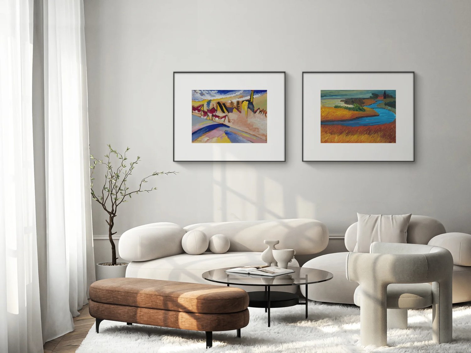
ePaper has no brightness of its own, so the room is effectively your backlight. In daylight, or with a picture light aimed at it, a colour ePaper frame looks rich and dimensional. In a dim room at night it looks flat and dark — precisely as a framed print would in the same room, and precisely why it does not glow at you during a film.
Buyers discover this for themselves. One wrote that with a good light source pointed at it “it’s really great”, and that when his room was too dark he would focus a beam on it. That is not a workaround; that is how wall art has always been lit. Galleries light paintings for exactly this reason.
| Lighting condition | How it looks | What to do |
|---|---|---|
| Daylight room, indirect sun | Best case — full colour, natural depth | Nothing. This is the design target |
| Direct sunlight | Contrast improves; no washout | Fine, though UV care applies to frame materials |
| Warm evening lamplight | Slightly warmer overall cast | Acceptable; consider a neutral picture light |
| Dim corridor, no local light | Flat and dark | Add a picture light, or choose a front-lit model |
Source: einksmart installation experience, 2025–2026.
What the refresh looks like
A full colour change takes a few seconds and is visibly a process, not a cut. The panel works through intermediate states as pigments move, which on older waveforms looked like a sequence of flashes. Newer waveform generations have made this noticeably smoother, but it is still nothing like a screen switching frames — and it is why colour ePaper cannot show video, a limit we cover in our frame comparison.
In practice most owners rarely witness it, because images change on a schedule rather than on demand. If the refresh bothers you, schedule changes for times when nobody is in the room.
What about ghosting?
A faint residue of the previous image can persist, and a full refresh cycle clears it. Ghosting is more likely on panels driven with aggressive partial-update waveforms to save power. When you demo a frame, change the image twice and look at a light area for a shadow of what was there before — ten seconds of testing that tells you a lot about the firmware.
How to see it honestly before you buy
Every marketing image of an e-ink frame you have ever seen was composited in software. The picture in the frame was placed there in Photoshop, at full LCD saturation, because that is how product photography works. It is not dishonest by intent, but it is not what the panel does. Ask for these four things instead:
- An unedited phone photo of a real panel in ordinary room light, not a studio. We were asked for exactly this by a buyer looking at another brand — it is a completely fair request and any manufacturer can satisfy it in ten minutes.
- Your own image, rendered. Send a photograph you care about and ask for it back on their panel. This tests the pipeline, which is the part that actually differs.
- A portrait and a blue sky. The two hardest subjects. If those hold up, everything else will.
- A close-up at 10 cm. You should see dither structure. A vendor who claims you will not is either selling something else or has never looked.
We publish close-up photographs of our own panels for this reason and will send more on request — ask us for your own image on a panel. If our rendering does not suit the work you want to display, we would rather tell you before you buy.
So is it good enough?
For art, illustration, photography prints and anything you would otherwise have framed: yes, comfortably. The medium reads as print because it obeys the same optics as print. For neon-lit night photography, high-saturation graphic design, or anything you intend to inspect from 20 cm, choose a different display — and we will say so on a sales call.
The one thing we would ask the industry to stop doing is showing these panels as if they were backlit. Every returned frame in this category that began with “this is not what I expected” was sold with an image the panel could not produce. Set the expectation correctly and the same product delights people, as the buyers who described theirs as “a beautiful product” in the same comment threads demonstrate.
FAQ
Why does my colour E-Ink frame show visible dots?
The panel has six pigments and builds every other colour by dithering them. Close up you see the pattern; at normal distance your eye blends it into continuous tone, exactly as with a printed halftone.
Why do my photos look sepia or washed out?
Two causes: the six-pigment gamut compresses saturated blues toward warmer neighbours, and the panel white is paper-white at about 34% reflectance. Good rendering software reduces this considerably; poor software makes it obvious.
Is the white really grey?
It is paper-white, not backlit-white — about 34% reflectance, closer to newsprint than coated art paper. A bright white matboard beside it makes the difference far more obvious.
Does room lighting change how it looks?
Completely. ePaper is reflective and has no brightness of its own. In daylight or under a picture light it looks rich; in a dim room it looks flat, like any print.
Do smaller frames look grainier?
They can, because you view them closer. Grain visibility is a function of viewing distance versus pixel density, not panel size alone.
What should I ask a vendor before buying?
Ask for an unedited close-up photograph of your own image on their panel in ordinary room light. Marketing renders are made in software; a phone photo of a real panel is the only honest evidence.
Next step
E-Ink picture frames explained
How reflective frames work, why they look like paper, and what to check before buying.
Read Insight
Are digital picture frames still worth it?
We read 489 buyer comments. The biggest problem is not the technology.
Read Insight
Large E-Ink displays: every size compared
From 7.3-inch frames to 75-inch panels, with the formats most buyers never find.
Read Insight